How to Extract Data from Graphs & Why Women Usually Park Worse
January 28, 2023
Occasionally I see interesting graphs and wish I could access the underlying data. Often that’s because I want to check a statistical claim or because I want to make the plot nicer. Unfortunately, however, underlying data are rarely available. So, I was wondering: Can I extract the data from graphs directly? After some investigation, I found that I could, and that it requires three steps:
- Taking a screenshot,
- marking the data points and axes, and
- extracting these annotations programmatically.
I will illustrate these steps with a graph that I want to re-plot. It comes from a study of sex differences in parking abilities (Wolf et al. 2009) that I found fascinating because of the insightful explanations that it provides. On the surface, the graph shows that the cliché is true: Women take longer to park worse (Figure 1).
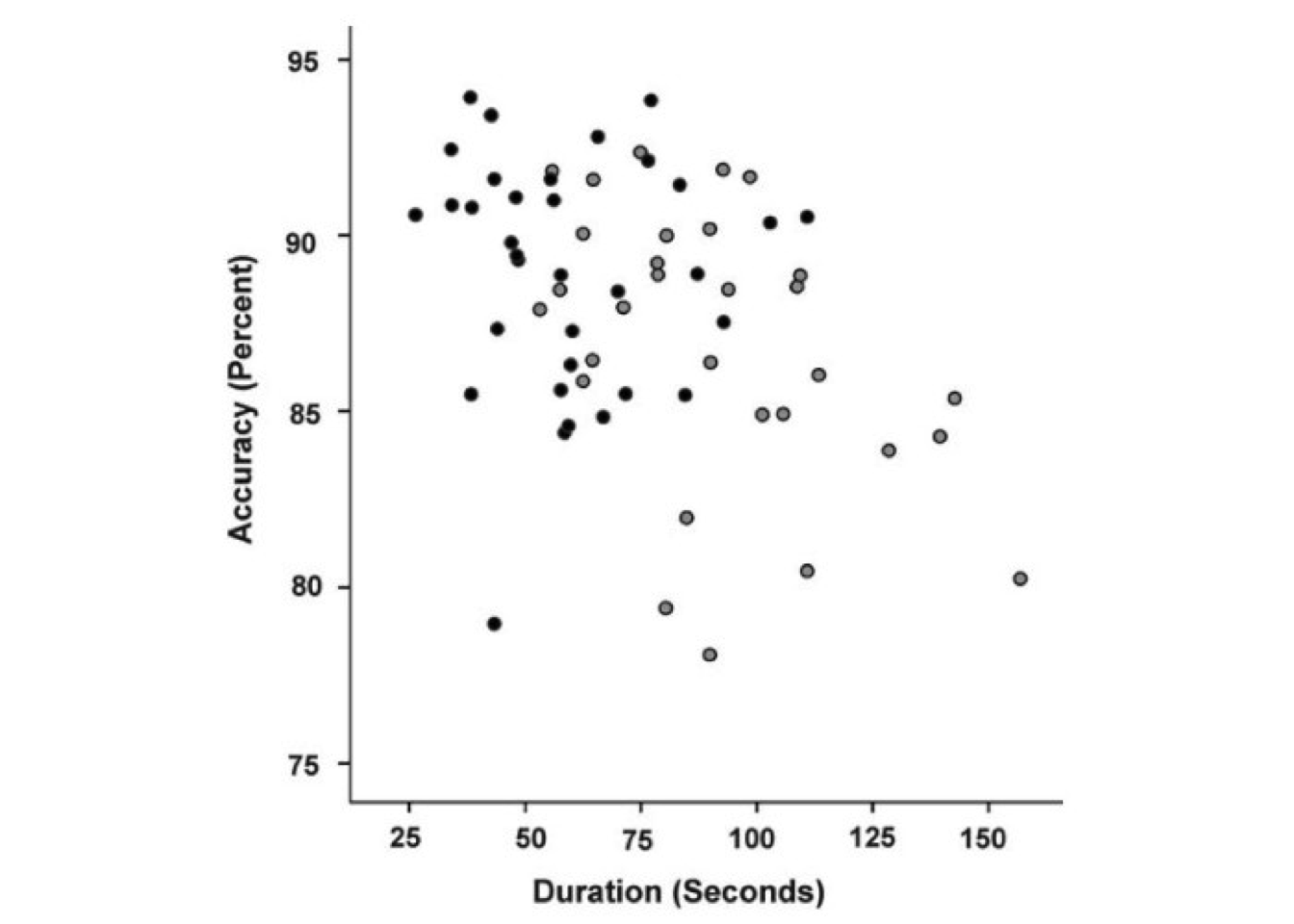
Figure 1: A graph taken from Wolf et al. 2009, which shows that—on average—female participants (gray dots) took longer to park less accurately compared to male participants (black dots).
The black dots, which show male participants, are—on average—located more toward the upper-left, showing that it took men less time (x-axis) to park more accurately (y-axis). The gray dots, which show female participants, on the other hand, lie—on average—more toward the lower-right.
But the researchers also looked below the surface and investigated WHY this is. They suggest that physiological differences become psychological differences over time. This is because in drivers without experience, female participants scored worse on mental rotation tasks, suggesting that there is a true physiological difference at first. In experienced drivers, however, that was not the case anymore; here, the female drivers just had lower self-assessments, so they thought less of themselves. So, over time, women appear to think less of themselves because of initial physiological differences.
Fascinating, right?
But for my taste, these intriguing results and the bland visualization in Figure 1 do not match because the differences are barely visible. So let’s go through the three steps to extract the data, so we can improve the plot.
Step 1: Taking a screenshot
This is easy, so no need for explanations.
Step 2: Annotating the data points and axes
First, we want to mark the position of each data point with a single pixel (Figure 2), so we can later exact their positions. We will automatically extract these pixels by color in the next step, so our colors should be unique. If we used colors that are in the picture already (such as black), extraction would yield the data points plus all other black pixels, which would be useless. But if we use unique colors (such as blue and red), extraction will only return the data points that we are interested in.

Figure 2: The annotations are barely visible because they consist of 1-pixel marks, but the figure shows the data point annotations with female ones being marked with blue pixels and male ones with red pixels.
Next, let’s mark two labeled positions on each axis, so we can translate the pixel coordinates of the data points to axis units. The markings from before give us the X and Y coordinates of the data points. But these coordinates do not tell us about the axis units that we are interested in (here, the duration, which is on the x-axis, and the accuracy, which is on the y-axis). However, we can convert the coordinates to these units if we know two positions on each axis and their associated values. If we know, for instance, that an x-coordinate \(X_1\) is associated with a duration of 50 seconds, and that another x-coordinate \(X_2\) is associated with a duration of 150 seconds, we then know that a value \(X_3\) that is halfway between \(X_1\) and \(X_2\) must be associated with 100 seconds (because it is halfway between 50 and 150). Therefore, we mark two points on each axis. As before, we do this with single pixels and unique colors to make extraction (in the next step) easier (Figure 3).

Figure 3: The annotations are barely visible because they consist of 1-pixel marks, but the figure shows the annotation of the x-axis. Two positions are marked with green pixels.
Step 3: Extracting the annotations programmatically
Once our screenshot is annotated with all pixels in the right places and in unique colors to identify data points and axes, we can extract the values programmatically.
We first import the annotated screenshot. Here I use R and the readJPEG function from the jpeg package, which returns a three-dimensional array of an image containing RGB (red, green, blue) values of each coordinate.
library(jpeg)
img <- readJPEG("parking-results-annotated.jpg")
Three-dimensional arrays are hard to handle, but let me illustrate what it looks like. The following listing displays three two-by-two matrices, showing the R, B, and G values of the four pixels in the lower-left corner of the screenshot. Since the values range between 0 and 1 and our values are all 1, we know that these pixels are all white.
img[1:2, 1:2, 1:3], , 1
[,1] [,2]
[1,] 1 1
[2,] 1 1
, , 2
[,1] [,2]
[1,] 1 1
[2,] 1 1
, , 3
[,1] [,2]
[1,] 1 1
[2,] 1 1For easier data handling, let’s transform the array to a two-dimensional data table. In this data table, every row describes one pixel, and the five columns give information about the pixels’ coordinates (x and y) and color (red, green, and blue).
library(data.table)
img_dt <- as.data.table(img)
img_dt[, V3 := factor(img_dt$V3)] # RGB column as factor
levels(img_dt$V3) <- c("r", "g", "b") # Renaming factor levels
names(img_dt) <- c("y", "x", "rgb", "value") # Updating column names
img_wide <- dcast(img_dt, x + y ~ rgb,
                  value.var = "value") # To wide format
img_wide[1:3] x y r g b
1: 1 1 1 1 1
2: 1 2 1 1 1
3: 1 3 1 1 1With these data at hand, we can set up two functions to transform the pixel coordinates to axis units. Let’s look at the x-axis function for illustration. The function takes the x-axis coordinate of a pixel and returns the respective duration in seconds. This works by calculating the relative position of the pixel between the coordinates of the axis annotations (I use the variable name rel_pos), and then using this relative position to return the corresponding values in axis units. For instance, if the axis went from 0 to 600 pixels, and the units that this axis shows went from 100 to 200, then an input value of 300 would be associated with a relative position of 50% (because it’s right between 0 and 600). In terms of axis units, these 50% would correspond to 150 (again, right between 100 and 200).
# Getting all green dots (which mark the x-axis points 25 and 150)
img_wide[r < 0.05 & g > 0.95 & b < 0.05]
x y r g b
1: 194 769 0 1 0
2: 749 769 0 1 0x_to_duration <- function(x) {
# Function that transforms x-axis coordinates to
# durations in seconds
rel_pos <- (x - 194) / (749 - 194)
return(25 + (150 - 25) * rel_pos)
}The function for the y-axis transformation is equivalent.
Now we can extract the data:
# Getting all female values (blue dots)
values_female <- img_wide[r < 0.05 & g < 0.05 & b > 0.95]

# Getting all male values (red dots)
values_male <- img_wide[r > 0.95 & g < 0.05 & b < 0.05]

# Adding all values to new data table
parking_data <- data.table(
    SUBJ = numeric(),
    SEX = factor(
        c(
            rep("female", nrow(values_female)),
            rep("male", nrow(values_male))
        )
    ),
    DURATION = c(
        values_female[, x_to_duration(x)],
        values_male[, x_to_duration(x)]
    ),
    ACCURACY = c(
        values_female[, y_to_accuracy(y)],
        values_male[, y_to_accuracy(y)]
    )
)
parking_data[, SUBJ := 1:.N]
Result
Now we have a nicely-formatted data table containing duration and accuracy values as well as the subjects’ sex:
parking_data[1:3] SUBJ SEX DURATION ACCURACY
1: 1 female 53.15315 87.90801
2: 2 female 55.85586 91.85460
3: 3 female 57.65766 88.47181With this data table, we can re-plot the graph to make the differences more visible (Figure 4). I annotated the axes with meaningful values that reflect the ranges and means of the two dimensions.
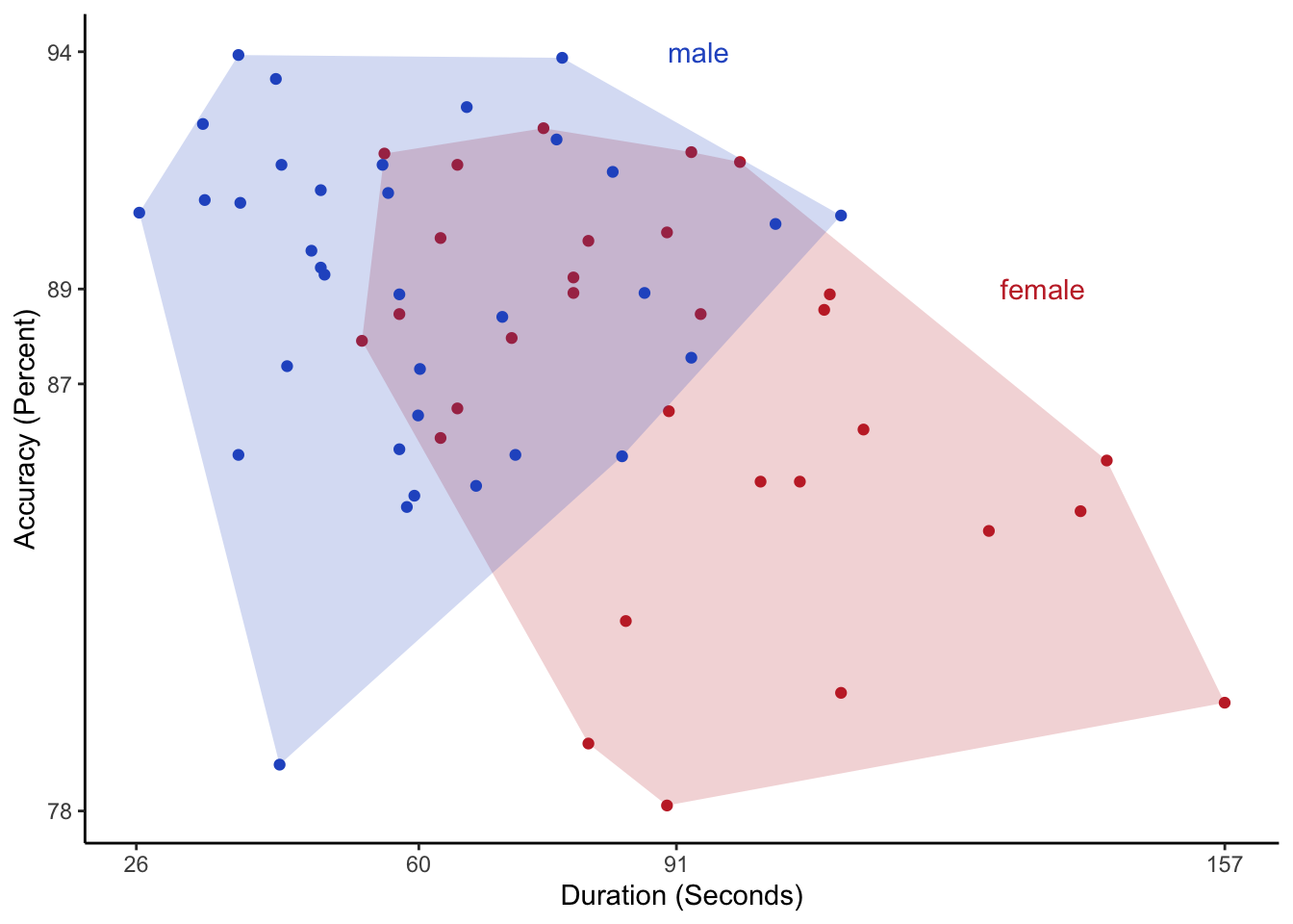
Figure 4: A nicer version of the original graph that shows the differences more clearly. The axis labels indicate the ranges and averages of duration and accuracy.
What do you think? Has the graph improved? And how would you plot the data? If you want to give it a shot, you can download the data.
References
Wolf, C. C., Ocklenburg, S., Ören, B., Becker, C., Hofstätter, A., Bös, C., Popken, M., Thorstensen, T., & Güntürkün, O. (2009). Sex differences in parking are affected by biological and social factors. Psychological Research PRPF, 74(4), 429–435. https://doi.org/10.1007/s00426-009-0267-6.
- Posted on:
- January 28, 2023
- Length:
- 7 minute read, 1457 words
- See Also: